Unleashing the Power of Block Controls in WordPress Editor
In WordPress the Block Controls are the elements and tools which are provided to the user when they are editing a block. Block Control allow user to perform the configuration related to the specific block such as make text bold, changing background and text color etc.
These controls are found in two places: the Block Toolbar and the Settings Sidebar
Block Toolbar
- The Block Toolbar is displayed above the currently selected block when the user selects it.
- It provides quick and accessible controls for commonly used actions related to the selected block.
- The
BlockControlscomponent from@wordpress/block-editoris used to implement the Block Toolbar.
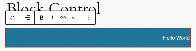
- Here we will create Toolbar Control given above which provide the setting to control the
alignmentof the text
// block.json

"attributes": {
	"alignment": {
		"type": "string",
		"default": "right"
	},
	"content": {
		"type": "string",
		"source": "html",
		"selector": "p",
		"default": "Hello World!"
	}
}
- add above attributes in
block.jsonfile to store the alignment and content of the block.
// edit.js

import {
  useBlockProps,
  BlockControls,
  RichText,
  AlignmentToolbar,
} from '@wordpress/block-editor';

import './editor.scss';

export default function Edit({ attributes, setAttributes }) {
  return (
    <div {...useBlockProps()}>
      <BlockControls>
        <AlignmentToolbar
          value={attributes.alignment}
          onChange={(value) =>
            setAttributes({ alignment: value === undefined ? 'none' : value })
          }
        />
      </BlockControls>

      <RichText
        tagName="p"
        style={{ textAlign: attributes.alignment }}
        value={attributes.content}
        onChange={(value) => setAttributes({ content: value })}
      />
    </div>
  );
}
- Here we have used the
AlignmentToolbarcomponent which provide the alignment control in Toolbar. It has 2 properties value and onChange RichTextallows users to input and format text with options for bold, italic, align, etc.
// save.js

import { useBlockProps, RichText } from '@wordpress/block-editor';

export default function save({ attributes }) {
  return (
    <div {...useBlockProps.save()}>
      <RichText.Content
        style={{ textAlign: attributes.alignment }}
        tagName="p"
        value={attributes.content}
      />
    </div>
  );
}
RichText.Contentcomponent used for rendering the saved content of a RichText block on the frontend (end user).
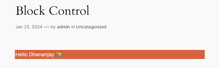
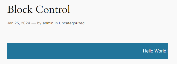
Output
- Block at end users side
Settings Sidebar
- The Settings Sidebar is used to display less frequently accessed configurations in a sidebar panel.
- It allows users to access and modify additional settings for the selected block.
- The
InspectorControlscomponent from@wordpress/block-editoris used to implement the Settings Sidebar.
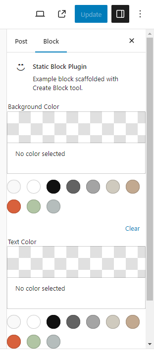
- Here we will create a Sidebar Control given above which provides a way to configure the background and text color of the text.
// block.json

"attributes": {
    "message": {
		"type": "string",
		"source": "text",
		"selector": "div",
		"default": ""
	},
	"bgColor": {
		"type": "string",
		"default": "#000"
	},
	"textColor": {
		"type": "string",
		"default": "#fff"
	}
}
- add above attributes in block.json file to store the message, bgColor and textColor of the block.
// edit.js

import {
  useBlockProps,
  InspectorControls,
  ColorPalette,
} from '@wordpress/block-editor';

import { TextControl } from '@wordpress/components';

import './editor.scss';

export default function Edit({ attributes, setAttributes }) {
  return (
    <div {...useBlockProps()}>
      <InspectorControls key="Settings">
        <fieldset>
          <legend>Background Color</legend>
          <ColorPalette
            onChange={(color) => setAttributes({ bgColor: color })}
          />
        </fieldset>
        <fieldset>
          <legend>Text Color</legend>
          <ColorPalette
            onChange={(color) => setAttributes({ textColor: color })}
          />
        </fieldset>
      </InspectorControls>

      <TextControl
        value={attributes.message}
        onChange={(value) => setAttributes({ message: value })}
        style={{
          backgroundColor: attributes.bgColor,
          color: attributes.textColor,
        }}
      />
    </div>
  );
}
- Here we have used
InspectorControlswhich allow us to add configurations in the sidebar panel. - We provide
ColorPaletteas children component toInspectorControls - In ColorPalette we changed the value of the bgColor and textColor attributes.
TextControlcomponent allows users to input a single line of plain text which is then saved in post_content on save.
// save.js

import { useBlockProps, RichText } from '@wordpress/block-editor';

export default function save({ attributes }) {
  return (
    <div
      {...useBlockProps.save()}
      style={{
        backgroundColor: attributes.bgColor,
        color: attributes.textColor,
      }}
    >
      {attributes.message}
    </div>
  );
}
- In save function we have given the bgColor and textColor as style to the div tag. So it make sure that when it is rendered to end users then component must have the provided bgColor and textColor.
Output
- Block at admin side
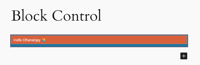
- Block at end users side